Blog

Data Visualization is Having Quite a Moment

Data Visualization is Having Quite a Moment

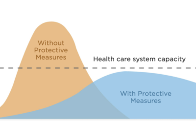
People are dying. The economy is collapsing. The world feels like it's falling apart. This is no time to be capitalizing on the misfortune of others, even to hijack a popular subject and inject non-essential content around it. (Never mind what some craven individuals...

Data Storytelling for Regular Folks

Data Storytelling for Regular Folks

Before I jump into data storytelling for regular folks, let me introduce this newsletter to you! I've been doing online courses here on LinkedIn Learning (previously Lynda.com) for about six years now. And I was thrilled when LinkedIn approached me to do a recurring...

Woodstock at 50…Visualized

Woodstock at 50…Visualized

In honor of the 50th anniversary of Woodstock, I created a data visualization of every data point I could find about the event. This project was full of interesting twists and turns along the way. This post is both a showcase of the project, as well as an explanation...

Visualizing Large Datasets

Visualizing Large Datasets

The theme for the July episode of my newest LinkedIn Learning course is "Visualizing Large Datasets". In this course, I do a lesson on a theme and then interview someone on that theme. Working with large data presents a unique set of challenges - not least of which is...

Adobe Illustrator and D3 Go Together Like Wine and Cheese

Adobe Illustrator and D3 Go Together Like Wine and Cheese

How's that for an enticing headline? Ever wondered how to do a highly customized design and then make it interactive and/or data-driven? One great technique is to design in Illustrator, export an SVG, and activate that using D3. Here's a VERY QUICK tutorial to get you...

Anecdotal vs. Causal vs. Statistical Evidence and Persuasion

Anecdotal vs. Causal vs. Statistical Evidence and Persuasion

You need to convince someone of something...to change their attitude about it...to persuade them. What's the best tool in your arsenal? This is a question I come across every day in my work. And, of course, given my focus on data storytelling and visualization, you...

The “Knew-It-All-Along” Effect and Data Storytelling

The “Knew-It-All-Along” Effect and Data Storytelling

A thought experiment, based on a psychological experiment: Assign (write it down if you want to!) the likelihood that Aladdin was a) Persian; or b) Chinese. Seriously, what would you guess? I’m going to tell you the answer. He was Chinese. OK, now go back, and be...

How to Tell Stories and Weave a Cohesive Narrative With Data

How to Tell Stories and Weave a Cohesive Narrative With Data

image: Storytelling is one of the most important evolutionary advantages humans have. That is a bold statement, but I believe it is true. When ancient man sat around the village fire, telling stories, they were teaching other villagers where to find food, how to...

Data Visualization Design and the Eye Candy Imperative

Data Visualization Design and the Eye Candy Imperative

Do you remember when people were bemoaning the horrible new scourge known as “Infotainment?” The word first appeared in the 1960s but became ubiquitous in the 1980s with the launch of MTV. If MTV News was the epicenter of “Infotainment,” then anchor Kurt Loder was the...

10 Tips for Better Data Storytelling

10 Tips for Better Data Storytelling

  1) Accept the fact that communication is your number one job Seriously. Nothing else matters as much as communications. Do it well and you will succeed in life, in your career, in your relationships… Be more clear, more easily understood, more creative and you...

Making “Love and Happiness in Anna Karenina”

Making “Love and Happiness in Anna Karenina”

"Happy families are all alike; every unhappy family is unhappy in its own way." When you start a novel with a sentence like that, you're broadcasting a message to your readers that your book is going to focus in on the happiness (or the lack thereof) if its...

Love and Happiness in Anna Karenina

Love and Happiness in Anna Karenina

Anna Karenina has one of the greatest opening lines in all of literature: Happy families are all alike; every unhappy family is unhappy in its own way. It’s a great line because it’s thought-provoking and so tightly written and clearly sets up an over-arching theme...

8 Immersive Virtual Reality Data Visualizations

Imagine stepping into a three-dimensional data visualization that lets you fully interact with the data. This is now possible thanks to virtual reality technology. Virtual reality data visualizations are computer generated, highly interactive, 3D projects. While the...

Creating Infographics that Stick

Why do you create infographics? Is it just to pass the time, or is there a strategic purpose for it? Maybe you’re trying to educate your audience about some important concept…or market an amazing new product…or advocate for some world-changing cause… Whatever the...

11 Must-Have Design Tools for Productive Marketers

Marketers rely on visuals every day to create compelling web pages and campaigns. We love good design, but we understand that you don’t always have time to create something beautiful. If you’re in need of a new logo, engaging website, fun font combination, great...

The State of the Data Visualization Practice (Survey)

Low N I created a survey in the spring to try to take the pulse of the industry. I was hoping to find out who is visualizing data - what types of organizations, how much are they spending on it, what kind of people are doing it, what's working, what's not working,...

Exploring the Human Development Index

If you follow global issues, you are probably familiar with the Human Development Reports from the United Nations' Human Development Programme. Each year, they report on the progress of nations as measured by one statistic they refer to as the Human Development Index....

15 Thought Leaders Define: What is Data Visualization?

Defining data visualization isn’t as easy as it seems. Some view it as a communication tool, while others view it as a process, outcome, relief, form of insight, culture, voice of the information age, or the perfect blend between science and art. We’ve collected...

NGOs, It’s Time to Up Your Visual & Data Communications Game

NGOs are Made of Data Most NGOs have at their hearts data like primary research into the issues they are working to affect, data on the beneficiaries and clients who they serve and data about their own operations to help them increase efficiency, decrease costs and...

5 Reasons to Visualize Your Data and Make it Interactive

  You believe in thought leadership as a marketing platform for your firm. And you believe that a key part of thought leadership is doing research and sharing your findings. Think you can create a 10-page PDF of those findings, slap it up on your website and...

3 Expert Tips on How to Grab Attention With Your Data Visualizations

This post originally appeared on the Visme blog. The moment you glanced at this post, you were judging it. Before you were even aware of it, you were judging how long it seemed, what colors are visible on the page and in the images, whether or not the visuals prompted...

Extracting Emotion from Your Data – The Key to Data Storytelling

“Storytelling is the new infographic,” I recently heard someone snidely remark. Her intent was to deride storytelling as the latest fad, or junk marketing. She assumes the lemmings will soon move on to another dumb idea, at which point we can safely ignore...

Color Theory Do’s and Don’ts for Data Visualization

This is a guest blog post from Marisa Krystian. Marisa is a Content Marketing Manager at Infogram, a data visualization tool that helps media, marketers and business decision-makers tell their stories with data. Color can grab people’s attention, set the mood, and...

2016: A Watershed Year for Data Visualization

2016 is going to be big. I think this year is going to feel sort of like we are at “peak data visualization”, though I don’t think we are. This will be an important watershed moment for the field in many ways due, in large part, because it is exploding on many fronts...

Infographics: Fad or Forever?

The other day, I gave a talk about Storytelling for a corporate event. And someone came up to me afterward and said, “storytelling is the new infographics”, to mean it is the next fad in corporate communications.I teach data visualization and infographics on...

I Owe It All to Kurt Loder

When I was young(er), I watched some MTV here and there…back when it was mostly a music video channel. Soon after the network launched, they created MTV News. Kurt Loder was the face of MTV News and almost single-handedly (I realize in retrospect) led me to get...

What Kind of People do Data Visualization?

Data visualization is a unique field. You have people who self-identify as designers, programmers, data scientists, economists, statisticians, journalists, academics…and more…all who might define themselves as being data visualization practitioners. This...

Learn Adobe Illustrator Scripting

If you use Adobe Illustrator (or if your colleagues or employees do), your worldview may be about to change. I discovered and started using Adobe Illustrator Scripting earlier this year and it is the best thing I’ve come across in a long time. Creating large,...

Do Less

My design philosophy is simple. And it’s really very applicable as a life philosophy. Almost without exception, you’re better off just doing less.  When deciding how many colors to use, how much content to put in a design, how many data points to...

How to Teach Anything…And the Metaphor That Keeps On Giving

Recently a friend asked me to help him take a ton of experience and knowledge he has on a subject and turn it into a curriculum for an online course he’s planning. He knew exactly what he needed to teach. He had 90% of the segments of the course all organized in...

Lessons Learned: Programming Live With an Audience

Have you ever tried to give a programming lesson on stage in front of 300 people? What could go wrong, right? I gave a talk at the HOW Interactive Design Conference in Chicago in October. The talk was titled “Data Visualization: From Data to Design to...

Speaking (Like Teaching) Helps Me Learn

I gave a talk at KAConnect 2014 in June and, as always when I speak, it was a really energizing and fun time. Speaking at conferences is a blast. I love choosing a new topic or refining an existing talk, outlining the “lesson plan”, gathering my materials,...

Data Visualization Fundamentals course on Lynda.com

After many many months of writing, planning, gathering examples, designing curriculum, preparing materials and recording, I’m thrilled to announce the launch of my course on Lynda.com, titled Data Visualization Fundamentals. In this course, beginners to the...

Does Your Company Actually Need Data Visualization?

The Harvard Business Review published an article of mine titled “Does Your Company Actually Need Data Visualization?”. There I talk about who should (and shouldn’t) bother with data viz. Take a read and feel free to comment there or email me or comment on my...

Journalism = Teaching = Information Design

I’m giving a workshop in a couple of weeks on “Thinking Visually and Interactively” for the Association of Management Consulting Firms. I’ve also been approached to teach an online course on the Foundations of Information Design. It’s an...

Hospital Pricing Visualization Challenge

I recently submitted an entry to a data visualization contest sponsored by the Robert Wood Johnson Foundation, Health 2.0 and Visualizing.org. The challenge was to create a static or interactive visualization of data on hospital pricing provided by Centers for...

Thought Leadership, Your Pipeline and Visualization

Your Pipeline Has a Leak 95% of your potential sales pipeline (the universe of people that COULD buy your services) is going to produce zip - not even an opportunity to pitch your services. Is there anything you can and should be doing to maybe make that 94% or 93% or...

The Right Visualization for the Job

Some people seem to think that data visualization has to be extreme, fancy, complicated and dense. I’ve seen visualizations that are incredibly beautiful and awe-inspiring as a design or programming portfolio piece. But they do little to illuminate the subject at...

To Interact or Not to Interact?

The world is getting more visual every day. See the meteoric rise of Instagram and Pinterest and the explosion of infographics as recent proof points. People want to see information, not simply read about it. This is, in part, due to the ever-expanding amount of...

The Best Hockey Team Ever

So it turns out the best hockey team ever…was the 1929-1930 Boston Bruins. Yep. That’s right. Data visualization is great. It lets you take the numbers, play with them for awhile, and find a way to make sure that the Boston Bruins come out on top! But...

Interactive = Mass Customization (which your clients want)

“Enough about me. Let’s talk about you…What do you think about me?” I love that joke. It is the perfect metaphor for so many things. And it’s something that I refer to frequently when talking to clients. The fact is, people are obsessed with themselves....

ASK… What Makes a Good Data Visualization

There’s good data visualization and there’s bad data visualization. Rather than quote Supreme Court Justice Potter Stewart’s definition of porn (read Jacobellis v. Ohio), I think there is actually a very specific answer to the question what makes a good data...

The Power of Graduated Complexity in Presenting Knowledge Content

Simplicity has won out over complexity. Many of the best consumer products are simple and elegant. Simple processes are preferred to the complex, artisanal foods are faddish. Everyone naturally seeks out the simple because simple is just better, right? Well, yes and...

Listen

We’re listening! Listen. It is the most important thing I do…for my clients, my friends, my family, etc. Rather than getting too Oprah about its importance for life in general, which it is, I’ll focus here on how listening applies to my world at Beehive...

Your Audience Has the Attention Span of a Goldfish

According to most experts, and depending on how you measure it, most adults have an attention span of about 15-20 minutes. That means they can focus on something for about that long if they’re really interested in it. A 3-year-old’s attention span is more...

4X4 Model for Knowledge Content

No one reads any more. The long form is dead. The written word?  That’s for grandpa! It’s all about video, baby! Everything I just said  is entirely accurate. And yet it’s all wrong. The King is Dead. Long  Live the King. The fact is that the web and its associated...

Information Connectedness

I’ve been thinking a lot about information connectedness lately. Actually, it’s been for about the past 10 years but it’s ramping up to new heights right now. We work with PricewaterhouseCoopers and World Economic Forum, having created...

Doubling Down on Davos

We’re doubling down on Davos this year, with two different clients and two projects launching for the World Economic Forum Annual Meeting. We’ve been working with PricewaterhouseCoopers for 10 years on KnowledgeConcierge, which this fall evolved into its...